
Coast to Coast Vision
This is the brand work I created for Coast to Coast Vision. The goal for this project was to develop a clean, high-end visual identity that still communicated value. The client wanted something that looked polished and modern, but without losing the sense of accessibility that is essential for a service designed to help people save money.
I focused on creating a style that feels elevated while still staying clear and straightforward. The branding uses simple, confident visuals that give a sense of professionalism, balanced with design choices that make the service feel approachable. The result is a brand that looks premium, yet still speaks directly to people who want practical savings and real benefits.


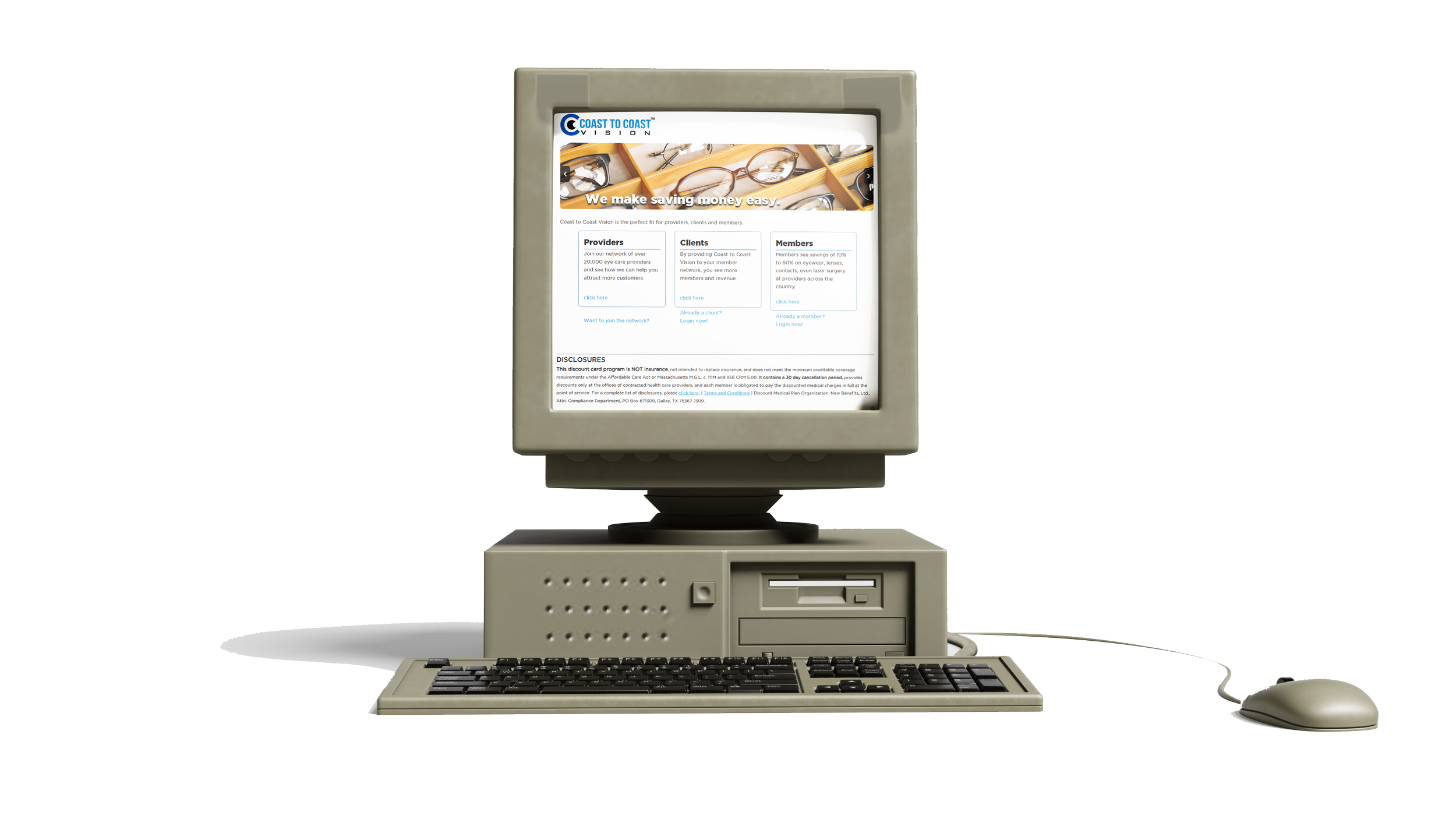
Out with the old
In with the new
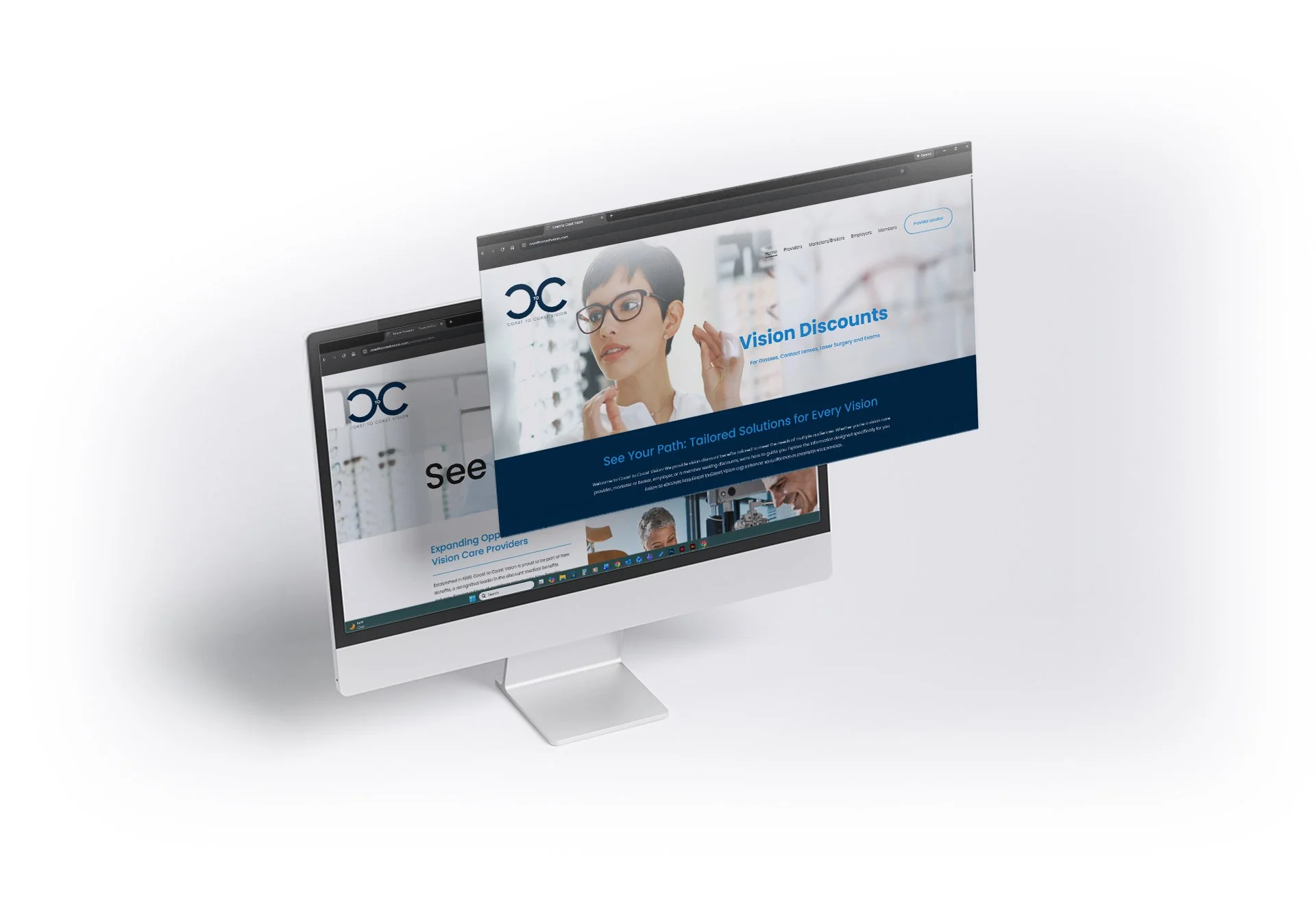
The new Coast to Coast Vision website was built completely from scratch. Design, layout, image selection, and copy were all rethought to bring the brand into, well, this century. Their previous site had not been updated since 2005, which meant the first step was convincing the internet that the company was still alive.
This rebuild had a unique challenge. The site needed to speak clearly to several different groups at once. Prospective vision providers needed reassurance that the program was credible. Brokers and marketers needed something that actually explained the offering without requiring detective work. Employers needed straight answers about value. Members simply needed to understand how to use the thing without getting lost. No pressure at all.
The result is a clean, modern site that delivers information without clutter and keeps the tone consistent across very different audiences. It is designed to look high-end while still keeping the message simple, helpful, and human. In short, the site finally reflects who the company is today instead of who they were when flip phones were still impressive.