Vista Auto
The branding project for Vista Ford was a chance to take a chaotic, overly complicated identity and turn it into something clean, flexible, and confident. The original logo was… let’s just say it had ambitions. It was more of a paragraph than a logo, packed with too many elements, and completely overwhelmed the eye. The challenge was to simplify without losing the essence of the company and to create a mark that could stand on its own while representing a network of well-established brands.
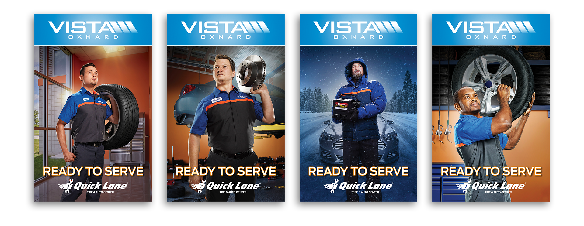
Vista needed to be the parent brand that carried the weight of Ford, Lincoln, PowerStroke, Black Label, Vista Ford Racing, QuickLane, and several others. Each of these brands has strict visual guidelines and its own identity, so the solution was to scale back the Vista logo to give it space to breathe and authority. The goal was to make “Vista” the lead brand, the one that creates awareness and ties all the other brands together, while still allowing them to shine in their respective areas.
One notable change was renaming Vista Ford Racing to Vista Motorsports to avoid confusion with Ford Racing. This small adjustment made a big difference in positioning and clarified the brand hierarchy for customers and partners alike.
The new Vista logo had to visually hold its ground alongside brand giants like Ford and Lincoln. It needed to feel at home next to Ford’s everyday, family-oriented personality while also pairing seamlessly with Lincoln and Black Label, which are high-end luxury brands. The design accomplishes both: it is clean, confident, and versatile enough to adapt across marketing collateral, digital presence, and co-branded materials.
This project was about more than just creating a logo. It was about establishing a parent brand that communicates stability, professionalism, and identity, while respecting and supporting the other well-known brands in the Vista ecosystem. The result is a visual system that is polished, flexible, and built to last.


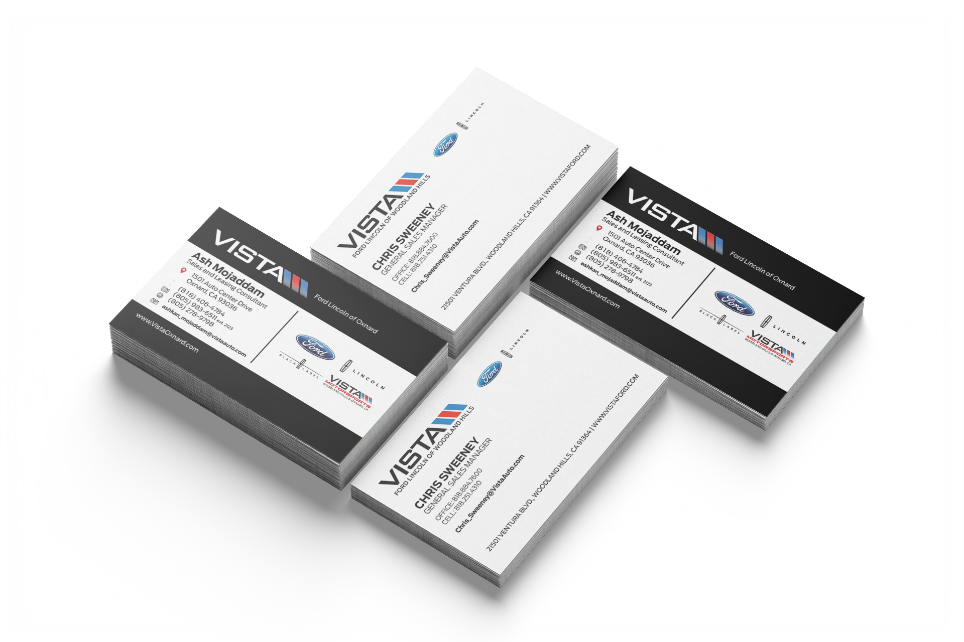

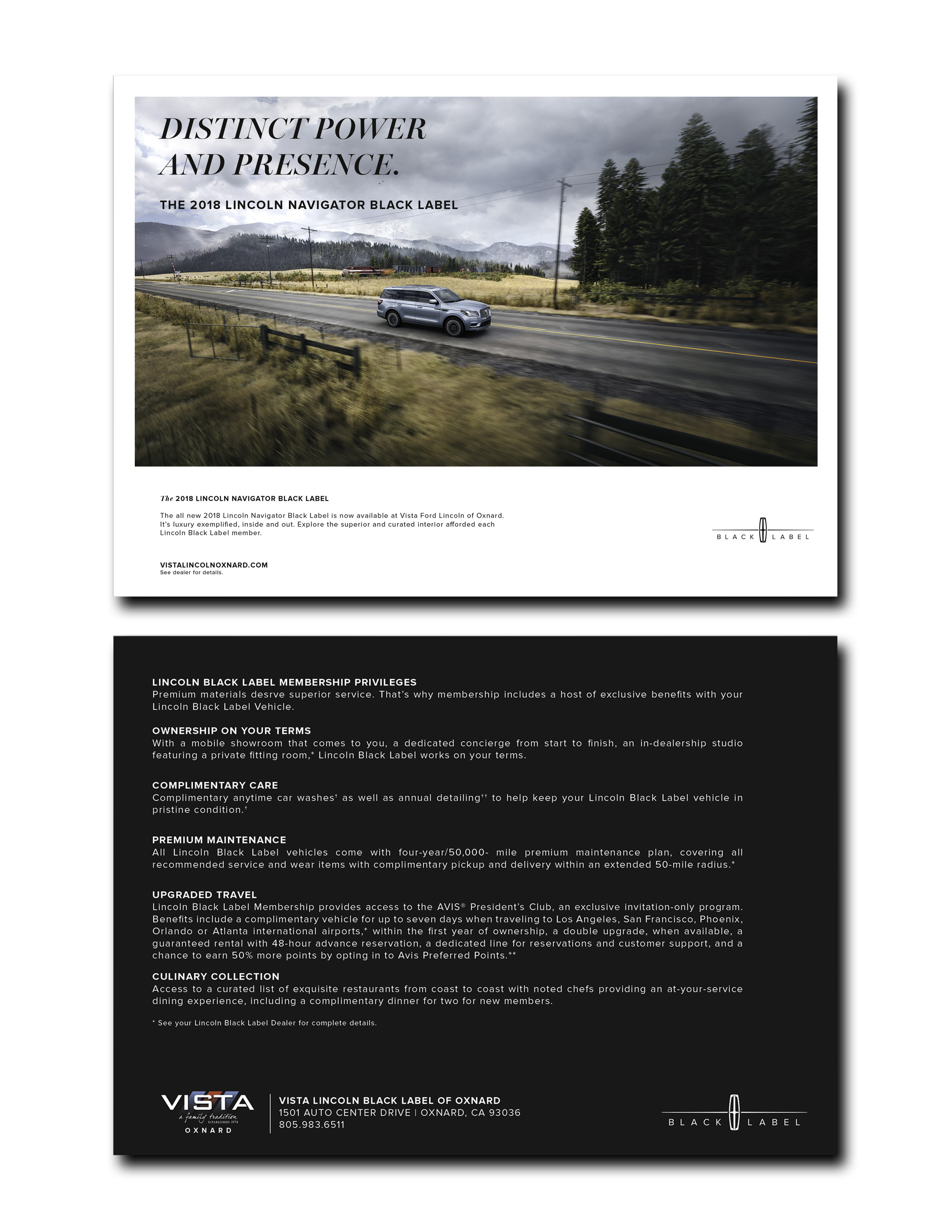
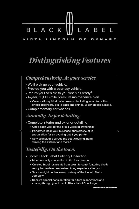
Working with Vista meant blending their branding with Lincoln and Lincoln Black Label, which is a bit like being asked to freestyle inside a very tidy, well-lit box. Lincoln’s brand standards are strong and precise, so creating custom pieces is more about following the formula than reinventing anything. The real creativity shows up in how Vista’s own identity is woven into those strict guidelines.
My job was to make sure Vista felt present without ever stepping on Lincoln’s toes. That meant finding smart ways to integrate their colors, voice, and personality into materials that already come with a rulebook attached. The result is a collection of print and digital pieces that stay true to Lincoln’s luxury standards while still giving Vista a recognizable and consistent presence across all their mediums.